Overview
Walmart Central America releases its Annual Report each year. This project was to release its Annual Report in 2019.
Problem
Take Walmart's vast amount of data and present it as accessible and understandable to investors, journalists, and users in general.
Process & Solution
We did a workshop with Walmart's team; the first session was to discover the highlights of the year, what they were proud of in 2019, and on the other hand, also their weaknesses throughout the year; they used different adjectives to describe them. The second session was to understand what they were looking for with this report we called "The Christmas Letter" and the look and feel of the website.
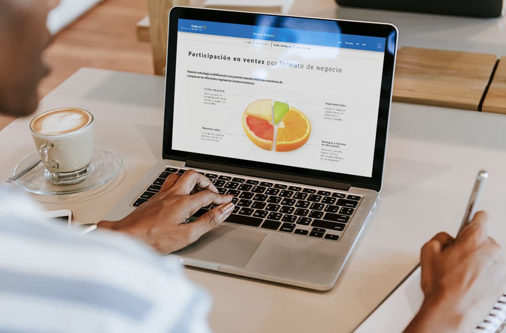
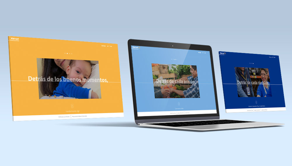
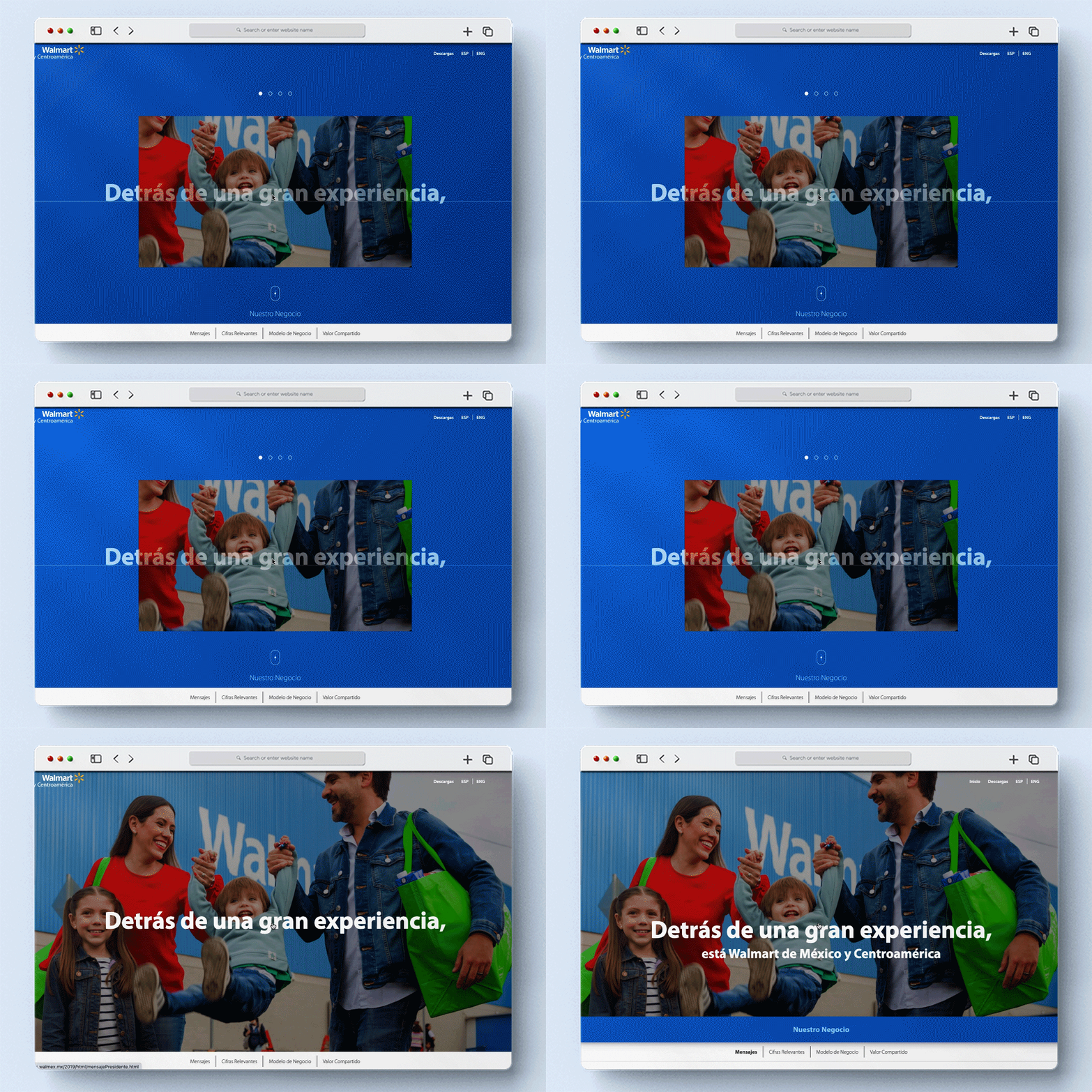
With the information from the workshop, we created the concept "Detrás de…" or "Behind the scenes…." showing different scenarios of how Walmart has become a part of users' daily lives; each one was a section or chapters of the report, and inside were subsections. With all the data shown, we made infographics using supermarket elements, like fruits, vegetables, cookies, etc.
Challenges
This year could have been better for Walmart Mexico for political changes; we needed to show that information, but we highlighted the bright side of that year. Another challenge was to find the right way to present the data because the client wanted more from the first design proposals.
- Tools: HTML5, CSS, Bootstrap, Photoshop, Sketch, InVision


