More
Сhoose
Overview
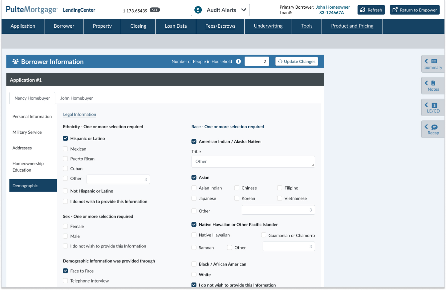
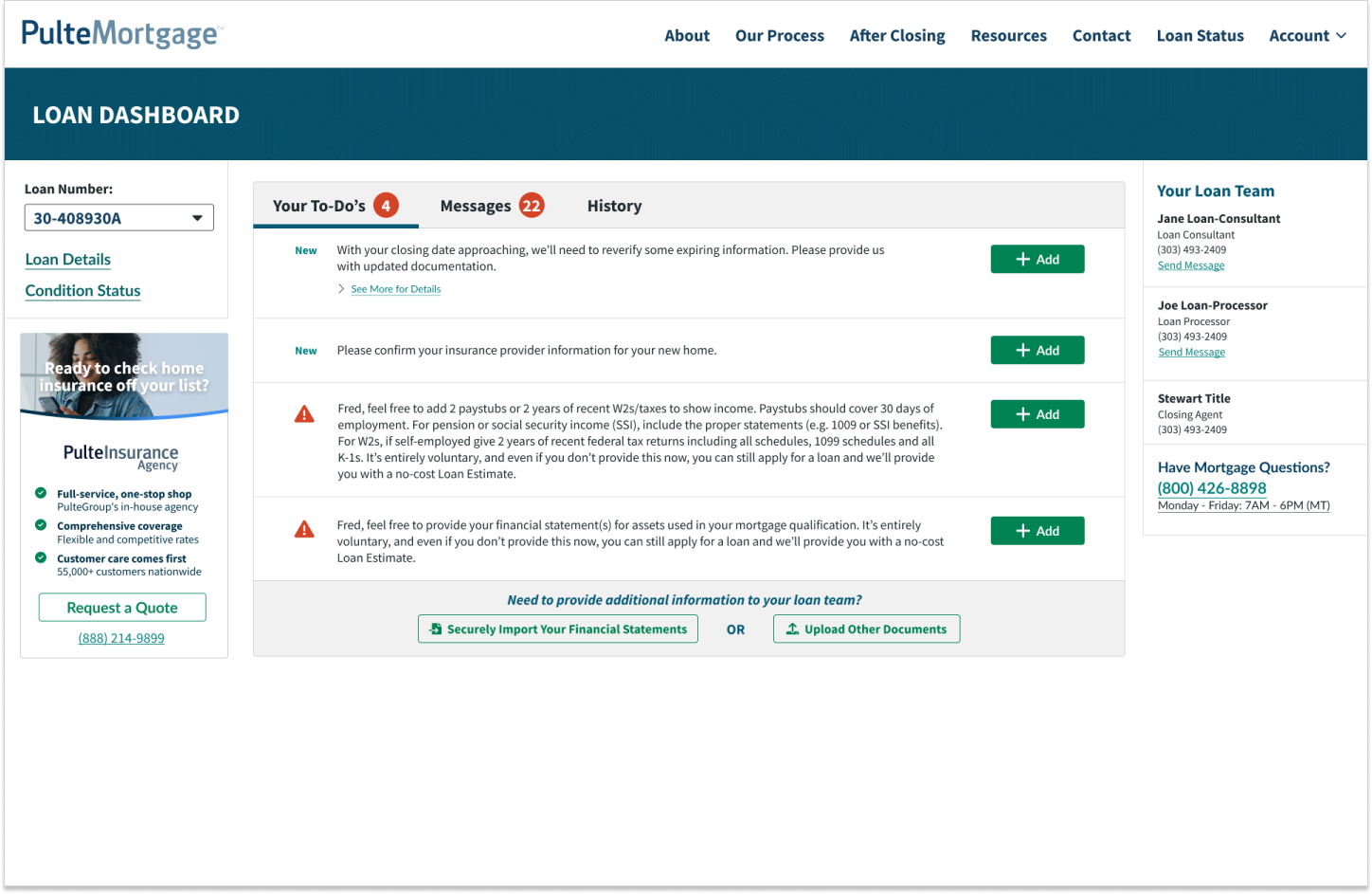
Pulte Mortgage is a company in the mortgage and credit industry with two different platforms: an external platform for clients to review all their mortgage or credit information and an internal platform called Lending Center, developed for company users such as underwriters, salespeople, etc. In this case study, I'll talk about the Lending Center platform.
Objectives
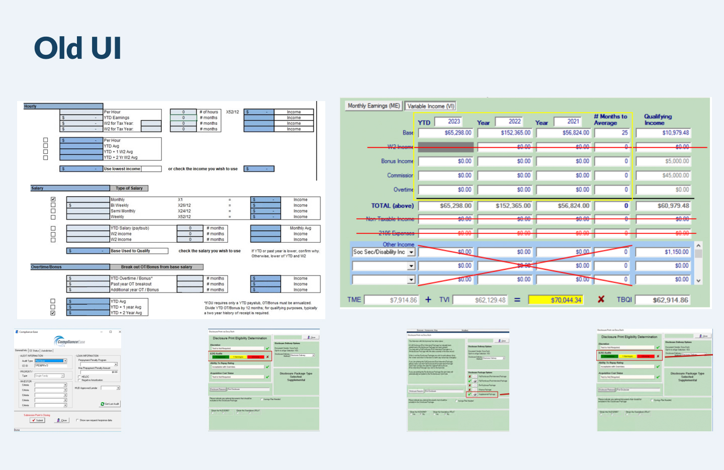
- Migrate the old platform to the new one and update the UI on the platform's screens with the new Component Library.
- The Design System wasn't defined, and some components weren't detached from the Bootstrap component library.
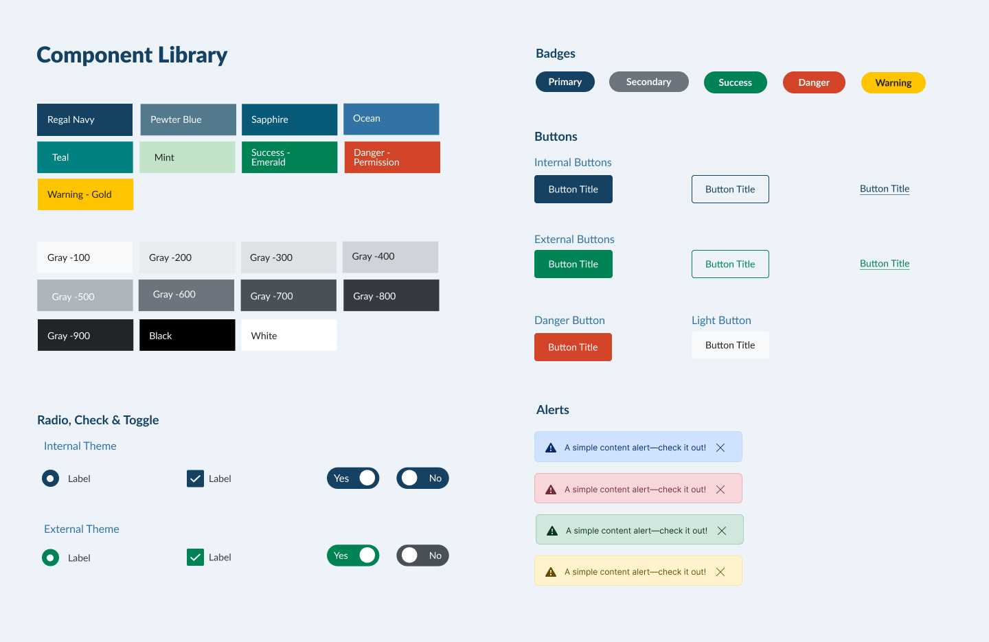
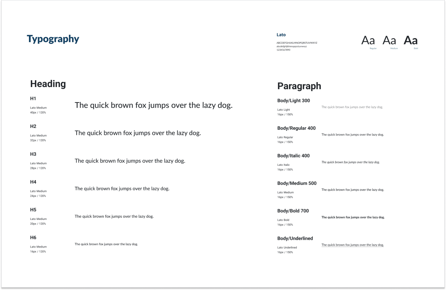
- Build a Design System and a Component Library to make an efficient and consistent UI.
- Improve the user experience to make it easier for the user.
Challenges
- When I joined the team, the project had already started; some components and screens had already been developed, and it wasn't easy to keep the UI consistent.
- The Design System wasn't defined, and some components weren't detached from the Bootstrap component library.
- The CSS files didn't follow the Component Library, and the final result could differ from the UI design.
- The migration from one platform to another needed to be fast and improve the UX; proposing new features or updating the CSS file to be consistent with the Component Library was less relevant in this stage.
- Tools: Figma, Adobe Suite, StoryBook, Zeroheight
